Create Your First Project
Start adding your projects to your portfolio. Click on "Manage Projects" to get started
Da Mhile Gin
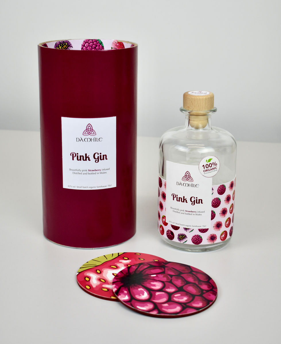
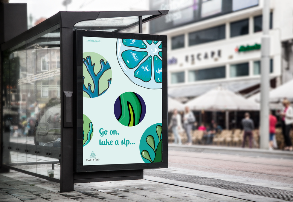
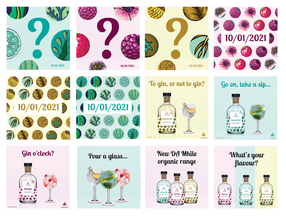
For this project, I undertook a full packaging redesign for Welsh gin brand Da Mhile, in preparation for its relaunch. I focused on a selection of their gins, which have unique and intriguing flavours. The final deliverables included a single bottle, a set of three transport tubes, and two coasters, with additional designs for other flavours, advertising posters, a website, and social media content to strengthen the brand’s identity.
This project allowed me to apply my illustration skills while gaining hands-on experience in creating physical packaging. It also helped me learn how to develop a cohesive visual system across different media. The process began with thorough research into Da Mhile’s existing brand, competitors, and the wider gin market. I explored trends in bottle and packaging design, as well as print finishes and successful marketing strategies.
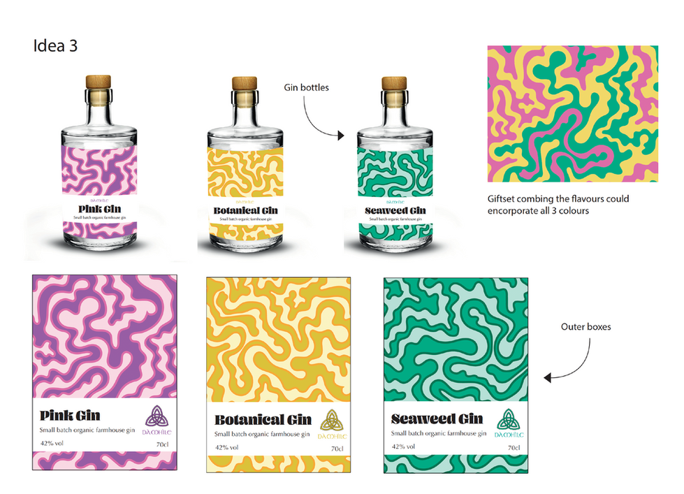
I started by sketching bottle shapes, label layouts, and visual elements. Using hand drawing and software like Adobe Illustrator and InDesign, I developed several concepts. I was initially drawn to circular labels featuring illustrations of each gin's ingredients, but early versions lacked clarity, particularly in differentiating flavours. After receiving feedback, I introduced bold colour schemes tailored to each gin, improving both differentiation and visual cohesion.
Though I developed two strong alternative designs, I returned to my original concept and refined it. I reimagined the bottle and outer packaging, incorporating a new label design that featured a smaller illustrative pattern wrapping around the bottle with a cut-out for key information. The result was a more premium, visually distinctive look.
While the label design was strong, it still lacked a clear unique selling point. As the gin range focused on organic, locally sourced ingredients, I decided to highlight this with an ‘organic product’ sticker. The first iteration drew too much attention and clashed with the design. After refining the typography, reducing the text, and adjusting the colours, the final sticker felt balanced and integrated well with the overall design, effectively communicating the product’s organic nature without overpowering the aesthetic.